Slight Adjustments
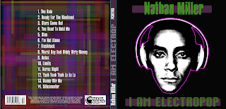
playing with the digipak's front cover lead to me bringing out the hue in the image. With slight adjustments making the saturation seem to increase:
Not a colossal difference but the feedback received was far better with many people saying it looks a lot more cleaner and sharp. When creating the back of the digipak cover, I put a opaque white square and an opaque black square. With the black square bringing out the colours and making it brighter and the white muting the colours. Despite being told to keep them mute, even the teachers agreed that the album cover looked far better. In addition to the new digipak cover, it became relevant to change the levels and remove the coloured eyes as it didn't suit to have both as it just over complicated the cover. Both good effects but the levels just suited a darker cover and the coloured eyes, the lighter album cover. Now all is needed is to add the final details such as company information and website name...
Front Cover COMPLETE


No comments:
Post a Comment