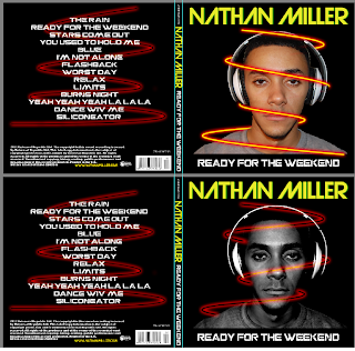
As I decided to create a design for my back panel, I did not want to have a similar design as the other back panels I looked at so I decided to create a swirl with a glow effect

I also decided to so an effect on my front panel after seeing this front panel, I did not want to copy the design so i decided to do the same effect to my front panel. Another reason why I decided to do the effect on my front panel iswell is becuase when I asked a few people what genre they thought the front panel is, aswell as getting answers like dj/rave which I wanted I also got R&B as a result a few times as they said the front panel looks too plain.
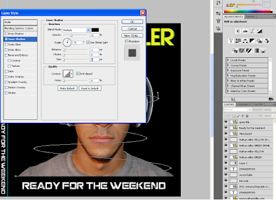
To create the design i first created a new path using the pen tool , then went to the brush tool and set it to the thichness that I wanted it to be and also the outline colour. I then selected the pen tool and right-clicked on the path and clicked on stroke>brush and then deleted the path. I then went on the layer properties and seleted inner glow, outer glow and also the outer shadow and gave them the colours and thinkness I wanted them to have.

For my front panel I decided it to have a different colour so that it stands out more..
I wasn't sure weather the effect worked for my front panel or not so I decided to play around with the colours of the swirl as well as my image
I thought that after the changes down the front panel looked much better but I decided to ask others so that I can get many opinions. I thought that the best way to get replies quickly was to use the social networking site facebook. I put up a picture showing both front panels asking people which one they thought was better.


As you can see more people liked the digipak with the front panels image given a colourless effect and the path given the same colours as the back panels path, after this I decided to keep my front panel with these effects/colours.


No comments:
Post a Comment