Tuesday 20 December 2011

Continuation of creation of digipak

Production of ancillary work

This is just a blog about the process of my digipak, as you can see below I have added more to it and the front and back of my digipak is near completion. 


As you can see I have nearly completed the back of my digipak. To ensure I was following the conventions of digipaks/cd albums, I got some ideas from the back of Calvin Harris's album.


As you can see, the design of the back of my digipak is similar to Calvin Harris' one. I have decided to be consistent by using the same 'Battle star' font I used for Nathan's name on the front of my digipak, and I have included his name, album name on the spine using the same colours too. To dim the brightness of the coloured circles, I used the shape tool to draw a large box (the same size as the left hand side of the digipak) then used to bucket tool to colour the box black. Doing this meant I couldn't see the circles anymore so I changed the opacity so that the circles were still visible, but under a black shade. As you can see the brightness of the circles has dimmed compared to the previous screenshot of my digipak. I did this so that the text I included will be visible and clear - if the cirlces appear too bright it would be hard to read the track list and other text that I included.
 I also had a look physical digipaks that my media teacher gave me, and realised all of them had a digit code on the spine, so I decided to include one in mine too, as shown below.


 On Calvin Harris' album, all the tracks are listed in the middle, with the 'bonus tracks' seperated by a dotted line - I decided to do the same with mine. Below this it includes the logo's of his record company. I searched the record company's that usually deal or have previosuly dealt with electrop artists, and decided to include the logo's of these record labels just below the bottom of my track list too. The record labels are Columbia, Island and BMG. I also included the wesbite address's for these record labels beneath.


I have also included a barcode at the bottom right-hand corner. Another thing I noticed about digipaks is that they all have some copyright information/information about the digipak at the bottom in very small font. So I decided to do the same thing as you can see below.

Now I need to work on editing and adding a picture of our Artist at the front of my digipak!

Friday 16 December 2011

Getting started on my digipak

Production of ancillary work

I have finally began producing my digipak using Photoshop. Below are some screenshots I have taken. 

(Please click on the images to see them enlarged)

Before I entered in any text, I opened up a programme called FontCase which has many different, unique & exciting fonts to chose from (unlike Final Cut Pro). When I saw some fonts that I may potentially use, I clicked on it, right-clicked and selected 'activate', after doing this the font I chose imported itself directly into Final Cut Pro ready for me to use (I was sble to import as many as I wanted). I had to note down the name of the fonts though so that I wouldn't forget and so it would be much easier to find!


Luckily, I was able to find the fonts I previously had in mind to use, so I used them and started creating my digipak.


As you can see, I have used a black background which I had already planned to use. 


I've used the 'Battle star' font for the name of the artist, and the dotted style font called 'Movie', for the name of the album. I will use yellow and white for the colour of my fonts throughout my digipak and advertisement.


Although I did not complete the front of the digipak, I started working on the back - creating the disco light effects that I wanted. I did this by using the shapes tool to create circles on top of eachother. I then changed the opacity to all of the circles (to about 20%) so that they almost looked see-through, and so you could see them over-lapping each other. I purposely created more yellow and white coloured circles to stick to the colour scheme of my yellow and white fonts.

Thursday 15 December 2011

Playing around with effects

Planning ancillary product

I was on my laptop on Microsoft Word and realised that it had some good picture effect features! So I decided to insert one of the images of Nathan and play around with the effects just to see how they'd look. Below is a little collage I made showing the effects I particularly liked.


I think I really like the grey scale and black and white effect the most, so I may use either one when editing my digipak.


I got the grey scale effect idea from FrankMusik's album. I think it looks very good against the black background.


If I decide to use the black and white scale effect, I will be taking a similar approach to the effect used on Calvin Harris' face on this album. It adds a sort of 'cartoon' style effect and gives it a rough look which I really like.

Taking some pictures of artist

Planning for ancillary product

We decided that before we begin making our digipak and advertisment, it will be best to start taking some pictures of our artist! So we got hold of one of the photography teachers and asked them if we could borrow their camera (as it is of much better quality than the normal small digital camera's) to take pictures. Below are a few images I took of the Nathan.


 I plan to use on of these close ups of his face for the front of my digipak. The image I choose will also be included in my advertisement too.

 I will also use of of these images for the inside left hand side panel of my digipak.


Before I took pictures of Nathan I had to explain to him the way I wanted him to pose. In one of my previous blogs I explained how I got some inspiration from one of FrankMusik's images, where he poses in a grey suit (the image above). As you can see, our artist Nathan isn't wearing a suit but is also dressed in smart wear - a shirt and a tie... and he has attempted to pose in a similar way to FrankMusik hahaa, nice on Nathan !!

Rough sketch of my advertisement

Planning ancillary product

Below is a quick sketch of how I plan to design my advertisement.

(Please click on it to see it enlarged)


I will use the same fonts and colours I plan to use in my digipak. The background will be black, with the same image of his face from the digipak (as you can see I have drawn it on the left hand side). An image of the actual front of the digipak will be included too so that the audience can know what they are looking for when they go out to purchase it. I have also included 'Includes his number one hits; Flashback & Ibiza. Available from all music stores and available to download from Amazon music and Itunes'. I have also included 'OUT NOW!' in large font at the bottom, and the website address of the artist at the bottom left hand side of the advertisement.

I got some of my ideas from a previous students' album advertisemnt.


I like the way she has written 'OUT NOW!' in large font at the bottom, and she also states the number one single which is included in the album. She includes an image of the digipak, uses the same background design and uses the same fonts and colours.

One in a billion - DVS

One In A Billion - DVS
One in a billion - dvs, exerts the exact same idea I had for my initial digipak front cover with his interior being filled with the urban London city. Downloading it on the weekend I thought it would be worth a mention despite not going through with that idea anymore because it is very nice urban artwork. The genre of artist DVS is UK rap/hip hop: 

Drunk feel on digipak

Drunk Feel On Digipak
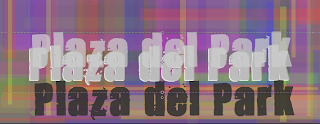
When writing my artists name and just generally experimenting with colour schemes I stumbled upon the effect of making the font look distorted and illusive. By duplicating the text and changing the colour to the nearest shade and just slightly moving it our of place of the original text layer. It makes it look as though the font is moving creating a dizzy effect. Not trying to dub myself as an alcoholic to the examiners but people sitting next to me agreed with the fact it makes you feel dizzy and in particular it illuminates. So I feel this would be interesting to be on a digipak in particular as it is not common but also adds additional value to the cover itself conforming to the checklist of allowing the audience to get something extra for extra money.


Beginning my digipak

Beginning my digipak
I had hit a brick wall with my mashup of my digipak as the informality blog highlighted it as diverting from the genres conventional informality. As I sat infront of the mac,  I noticed many students only use one colour as a background. I personally feel that this is very bland and needs something additional so I had an idea to make my album cover pixelated. Initially it was inspired by hip hop artist Chris Brown with his album F.A.M.E . Up close you can see that the different colours are posters of him but from a far the posters are very small and just make for a very creative album cover in terms of artwork. With this being said I began to draw blocks and changed the opacity with every once in a while changing colours. Here are some screen shots of this process. 


As shown by the many screen shots above, we can see the colours gradually overlay each other and tone itself down. Following the suggestion that we shall not use bright colours for our digipak I used a big white square and threw it on the album (the third from last picture illustrates this) to tone it entirely down. These pixelated colours were used in reference to the Yellow Magic Orchestra's video computer games. In this retro day and age with everything being "resurrected" I feel this would catch a audiences eyes with with a real sense of retro electropop plus there is no way people would miss this album in a shelf full of others. The pixelated theme will be throughout with the idea of pacmans and other retro video game characters appearing in the albums interior covers. Perhaps mixing it with the new school electropop...

Informality

Informality 

Something I noticed regarding all electro pop artists is the high level of informality and colloquialism when presenting themselves. Just like rap and hip hop are associated with caps and hoods, Electropop is associated with scruffy five o clock shadows and crinkled clothes. Which I believe is to reflect the party lifestyle of an electropop artist.

Initially, I thought I may try and reflect the drake very calm and sophisticated look as here stares severely into the camera. With the autumn trees in the background being blurred out. I wished to make my jacket/blazer engulfed in disco lights or even images of  the night of the party. However with further analysis and just noticing that electropop artists are not this level of sophistication on album artwork despite me wearing a suit for my music video. Drake is a R&B artist, and despite not having any influence on my own genre. The detailed analysis of the electropop genre taught me that at one point electropop was dead and was resurrected in an age where genre boundaries were merged. One of the main things that really draw barriers between electropop and other genres is the colours they use for their fonts and just general album artwork. Such as the colloquialism, with this being said I have scrapped my initial idea to wear very formal clothes and if so, make it very "casual" in the sense that my tie will not be tightly done. 
Seen in this David Guetta album One Love. We can note the level of informality and colloquialism by the fact he is not shaven, he is wearing a casual t-shirt and the ever popular sunglasses make an appearance. Point being, the pictures due to be taken will be very informal and I myself personally believe people should make an effort for their own album artwork. However the genre electopop does not agree so I will be very casual. On another note, we can see the font colour a hot pink style colour which is typically associated with electropop. Despite the possible connotations of feminism, the audience will automatically relate it to strobe lights and discos. This wil account for the bright colours used in my digipak front cover. 

Wednesday 14 December 2011

Creating my digipak: Back Panel Problems

Although I chose the font that I wanted for my track list, I came accross a problem. Even though I wrote the track list in line, becuase of the shape of some letters the track list does not look straight which is resulting in the digipack looking very unprofessional.

I put up a grid on photoshop so that it is more clear how the list looks, although they should be in line they are not.

I have also checked out other electro-pop artists to see how their back panels looks like:


These albums are from David Guetta, Example, Owl City and Benny Benassi. As you can see that most of them have graphical elements but also as you can see simple design's. If you look at Owl City's albums, all his back panels have simple designs with a picture on it with the track list on-top of it.

This has made me think that maybe I should have some type of graphical element in the background on my back panel.