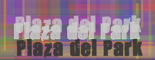
Drunk Feel On Digipak
When writing my artists name and just generally experimenting with colour schemes I stumbled upon the effect of making the font look distorted and illusive. By duplicating the text and changing the colour to the nearest shade and just slightly moving it our of place of the original text layer. It makes it look as though the font is moving creating a dizzy effect. Not trying to dub myself as an alcoholic to the examiners but people sitting next to me agreed with the fact it makes you feel dizzy and in particular it illuminates. So I feel this would be interesting to be on a digipak in particular as it is not common but also adds additional value to the cover itself conforming to the checklist of allowing the audience to get something extra for extra money.


No comments:
Post a Comment