After trying out a few fonts I have decided to go with
CaptureIt2. The reason for this is that i feel that it relates well with my genre and also the it goes with the urban theme that I initially wanted to go with. Now that i have selected what font I am going to use, I was now faced with the task of editing and cropping my image of my artist that would go on my front cover. Below are some of the steps I took to do so:
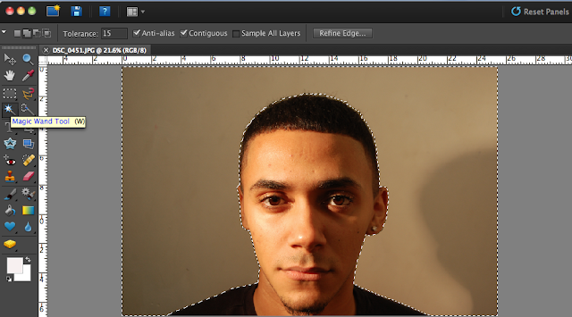 |
| I used the Magic wand tool to Delete the background out, as you can see in the top left hand corner i had to reduce the tolerance to about 15. I did this to make the Magic wand tool less sensitive to colour, which in turn would make it easier to crop out my artist from the background. |
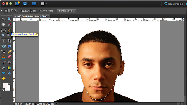 |
| After doing this, the image still had my artists neck and shoulders in it. So to get rid of them; as I only wanted my artist face, I used the Polygonal lasso tool. I used this because it was the easiest and most effective way to select a specific section of an image. |
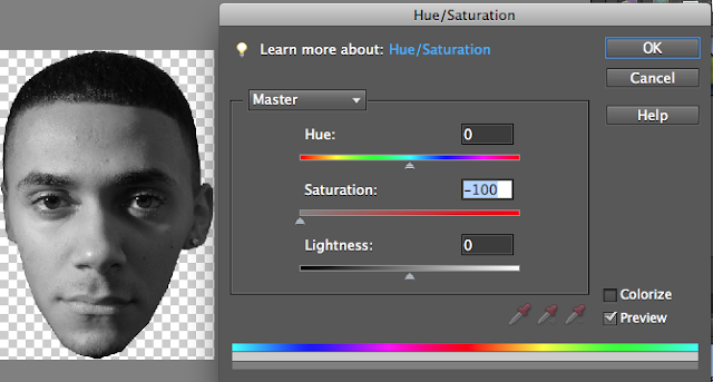 |
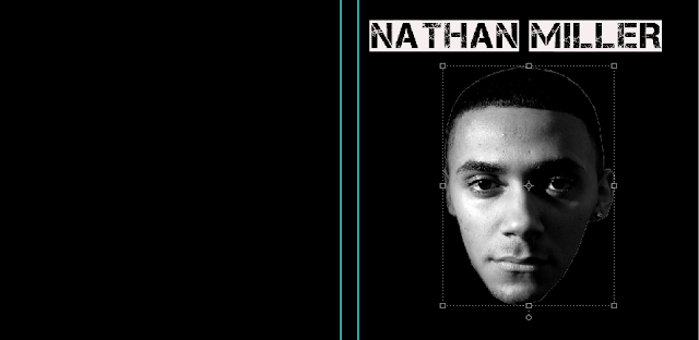
| I then adjusted the Saturation to -100 to make my image Grayscale. |
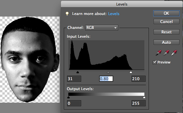 |
| Then I ever so slightly adjusted the input levels, to give my image a sort of shadowy effect. Which I thought mad my picture look quite cool. |
 |
| This is as far as I got that lesson, as you can see it isn't much; but I hope to improve it in my next lesson. |


No comments:
Post a Comment