Thursday, 12 January 2012

Production of Ancillary work: Beginning to create digipak

I first opened up the template we was given to create our digipak on. I then looked into more fonts using various websites mainly looking at techno/futuristic fonts.


Also after looking at David Guetta's cover of his single "Sexy Bitch" I decided that I should try out using his font.


I also looked into the font I will be using for my back panel where my track list will be.


Here is a picture I took of the paper where I have written up all the fonts I tried out looking if it would suit my digipak/advert.


After finding the one I wanted I applied the font onto the back panel of my digipak.


Although I found the font I originally thought of using after applying it on my digipak i came across a problem where the track list doesn't look in line, you can see this by the image below when i put up the grid tool in photoshop. 


As you can see due the the shape of some of the letters I have decided to change the font.


Here you can see the new font I will be using for my artists name. I also decided to use yellow as my main colour throughout my digipak. The artists name also has another layer underneath it which is a tone of green, this will not be very obvious when seeing the digipak straight away but I believe it makes the artist name look better and not just a simple yellow.


I also have change the font of the track list as I had a problem with the layout of it.


You can see that I have also changed the font for the albums name which matches the track lists font now. This now means I am only using two different fonts which was advised before we started making our digipaks.
I have also changed the colours of some of the songs to yellow and green as they are my main two colours that I am using as well as white.

I then choice which photo I wanted for my front panel as we went to take pictures of Nathan(our artist) earlier. After choosing the image I wanted to use i cropped it out and placed it in position.


Here is how my digipak looked after I added the photo to the front panel


Planning Ancillary Products: Mock-up of advert

Here is a mock-up of my advert I have done.

The albums main features will be it saying "OUT NOW!" to show that the album is available to buy/download now, the artists name which is NATHAN MILLER, the digipaks front panel and also a close-up of the artists face to make sure people recognise him. The close-up of the artists face will be the same image that will be used inside the digipak.
There will also be more information on the advert but will look more small.


After showing my mock-up advert to my teacher I was told to change size of the artists name as that should be the most obvious and eye-catching text on the advert.

Here is how my mock-up of my advert now looks like as I have made the artists name the biggest text and also at the top of the advert.

Planning Ancillary Products: Mock-up of digipak

Here is a mock-up I have done for my digipak. As this is a mock-up my final product may not exactly like this but will be mostly similar.


Here are the front and back panels of my digipak. As you can see the front panel has a close up of the artists face while wearing headphones and having a stubble to give a rough look. This will give people the impression that he is a dj.
The front panel also consists of the artists name which is placed at the top of the panel and also the albums name which is placed at the bottom of the panel with a different font and a smaller size.

The back panels man feature will be to show the track list. I have written "TrackList" in the same font as the albums name to make sure I do not use too many different types of fonts as we was told to use 1-2 fonts. For the list of songs i will be using a 3rd font even tho we wasn't advised to do that.


Here is an image taken of me while I was drawing my mock-up. You can also see that on my mac's screen I was searching up what type of headphones I want my artist to be wearing for my front panel image.


Here you can see where I got my ideas from, I would be using similar fonts that other artists in the same/similar genre use's.


 Here is my inside panels. 

The inside left panel consists of another image of the artist but only half is face. The artist will again have a stubble in this picture to give a party/rough/fun look. I will also attempt to make his eye colourful like a spectrum circle to give a club look as they have disco balls.  

Beside the artists face there will be the lyrics of our single which we made a video to, this is so that the fans and other people who buy the digipak can sing along to the song and look at the lyrics if they do not know them.

So far I have not planned what will be on the right inside panel as most digipaks do not have anything on that panel apart from a picture of the artist.


Tuesday, 10 January 2012

Digipak Progress

Digipak Progress

I Am Electropop began using a series of square blocks and changing the opacity of them to overlap and mix the colours making it look very unusual and unpredictable. This was assisted by the grid tool, allowing for me to see whether text was in line.
In reference to the Yellow Magic Orchestra and their video game theme. I began experimenting with the overlapping of square blocks to summon a digital character similar to Pacman and other retro games, which I feel would be interesting to have on the digipak and a theme of retro games as it conforms to a back to 80's feel. An idea also sprung up to perhaps have my face over the character or pixelate my picture, however this will clash with the our teacher's advice to not apply unnecessary effects onto images. 


Monday, 9 January 2012

Continuation of inside of digipak

Production of ancillary work

The inside of my digipak is close to complete! I have shown below what I have done so far....

This is what I've done to the left hand inside panel...

(I've just realised I have worded the quotation differently in my digipak so I need to change it!!)


Now this is a close up of the right-hand inside panel...

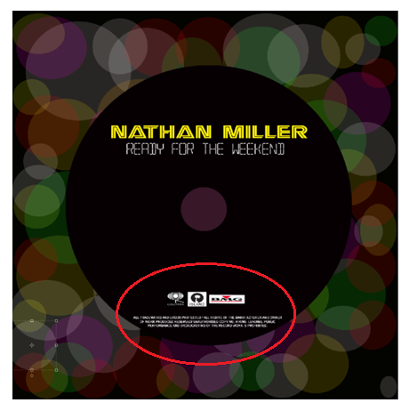
I wanted to keep the design of my CD quite plain and similar to the design of FrankMusik's CD (as shown in my one of my previous blogs). I have included the record label logo's at bottom and some copyright information too (this is conventional for most CD designs). I don't think its complete though I may make some changes to it or add more to it.....

JUST ANOTHER THING....

I managed to change the font style of the title of my album as I said I would in one of my previous blogs....


As you can see the text is now much more visible!! I have used the same font that our original artist of our song (Calvin Harris) used in his album.

Sunday, 8 January 2012

Getting started on the inside...

Prodcution of ancillary work

Since the front and back of my digipak is (very near to) complete, it's time to start working on the inside!

This is the inside of my digipak...


I have decided to use this image of Nathan for the inside left hand panel.


I opened up this image on Photoshop and used the 'cut out' effect (the same effect I used on the image on the front of my digipak) to edit the image. I decided to do this to keep my digipak consistent.


This is what it looked like after applying the effect. I liked it and so decded to add it to my digipak.


I didn't want to include the grey background so I used the paint brush tool to colour the background black as you can see. But this didn't work so well as it was hard to paint at the most tiniest spots, and it looked obvious that I had used the paint brush tool. I couldn't decide If I wanted the image in the centre, or on the side with half of his faced cropped off!!??

(I slightly changed my original idea of having an image of him in the left hand bottom corner with a little biography about him on top -  I think this is uneccessary, I want to keep it simple)


 I decided to put the image back to its original size and adjust it on to my digipak (images above). I then played around with it to see what else I could do to the image to make it look more interesting......

Completing front + back of digipak

Production of Ancillary work

I have finally managed to complete the back and front of my digipak! The deadline is very soon so its time to complete the inside and get started on my advertisment too! Below is a quick video I made showing the little problem I had whilst working on the image for the front of my digipak.

  
Below is a screenshot of the front and back of my digipak... I wouldn't say this is the final edit as I will make some changes to it later.


One of the things I will change is the style or colour of the font for the title of his album ('Ready for the weekend')... as you can see it is no longer clear because of the image of the artist...